
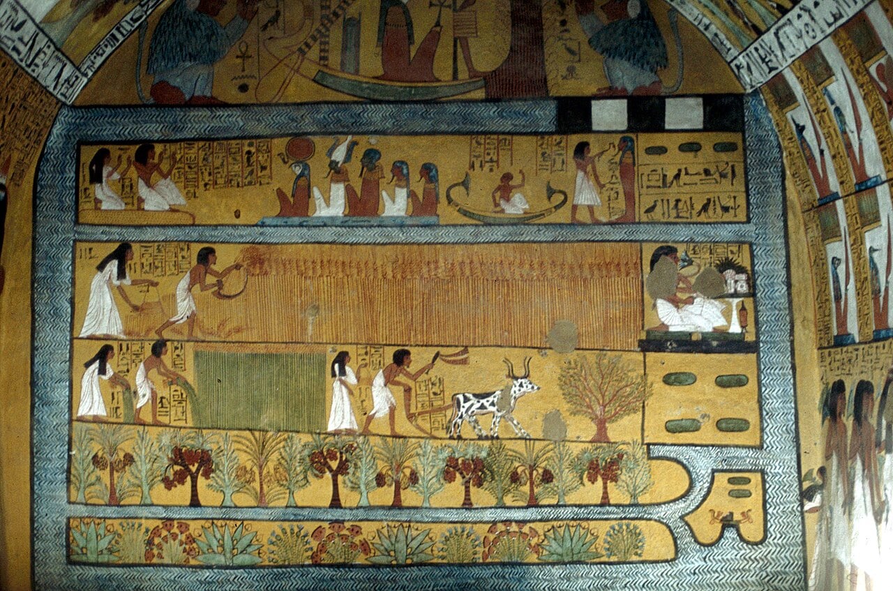
In December 1979, Bridget Riley visited Egypt. The trip had a transformational effect upon her work, and an example of her new approach to painting can be seen on Piano Nobile’s stand at TEFAF Maastricht.
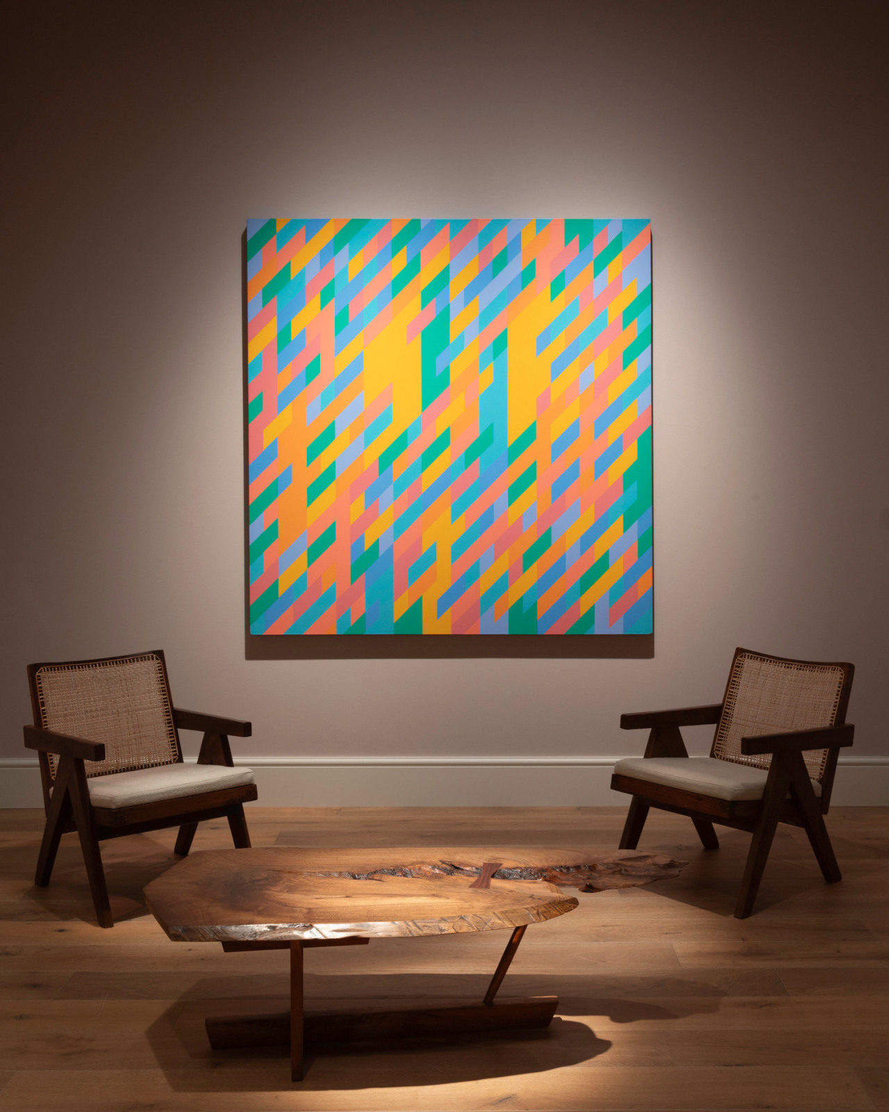
InSight No. 167
Bridget Riley, Into Place, 1987
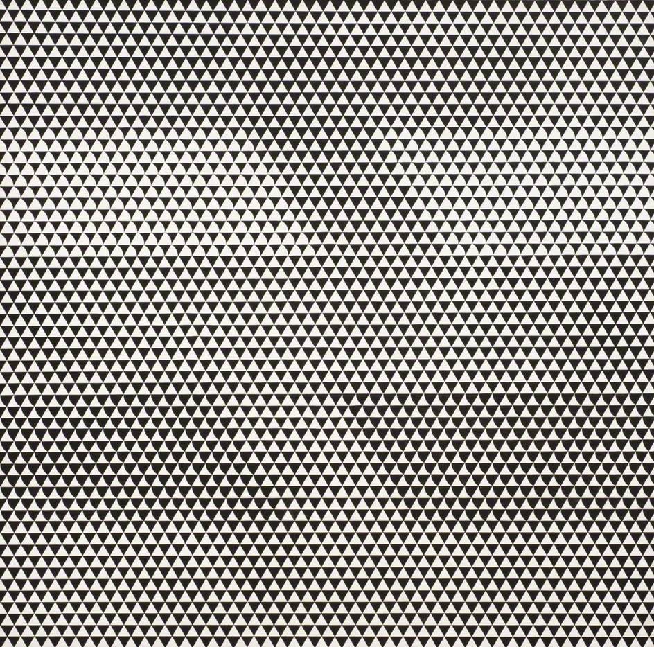
Bridget Riley (b. 1931) established her reputation in the early sixties with dizzying feats of optical art. Her monochrome, design-like paintings of the period were often composed from elementary units of stripes, squares or triangles, and they ripple with the illusion of shape and movement—rotating, receding, curving—even as their surfaces remain flat and still. These paintings pushed abstraction to new limits and were immediately recognised as a significant and original vein of modernist art. Examples were quickly acquired by public collections in Britain and the United States including the Museum of Modern Art in New York.
Success did not make Riley complacent. She continued to develop new illusions through her work of the sixties and seventies, until a short visit to Egypt in December 1979 and January 1980 suggested a new direction in which she might develop her work. As the art historian Robert Kudielka has described, it was only in recollection that the visit—and a particular ‘colour sensation’—began to affect Riley. One of the sites she visited was the tombs at Deir el-Medina, an area occupied by the artisans who worked on pharaonic tombs in the Valley of the Kings nearby. The modest chapel-like tombs of officials such as Sennedjem had a significant effect upon Riley, most especially the palette of colours used in wall paintings: yellow, ochre, pale green, blue, black and white. In striking contrast to the bright, synthetic, often spring-like colours of her painting in the seventies, the colours of ancient Egypt provided a basis for Riley’s new palette in the eighties.
The change in Riley’s work concerned not only her palette but also her conception of colour. In her previous work, colour was used in narrow stripes to produce shimmering optical illusions. The beholder’s vision was bamboozled by the accumulation of contrasting colours, and two or three hues transformed into a haze of new colour that existed in perception rather than in the painting itself. The optics of such paintings were self-consciously developed from the pointilliste approach of Georges Seurat, who used small, clustered ‘points’ of colour to produce pictorial effects of atmosphere, distance, and so on. Through the early eighties, following her visit to Egypt, Riley came to broaden her use of colour and to explore instead its spatial or ‘plastic’ properties.
Applied thinly and evenly to finely woven linen, oil paint creates a space that is inseparable from the colour of the paint. Space and colour become synonymous. In the eighties Bridget Riley began to explore the opportunities arising from this phenomenon, and thereby reinvented the appearance of her work and the public conception of her artistic identity. Between 1980 and 1985, she made paintings with narrow vertical stripes in a palette suggested by Egypt. Kudielka described the ‘stripe’ paintings as ‘the apex of [Riley’s] transition from the earlier, chromatic use of colour to the spatial and “plastic” emphasis’ of later works. Then in 1986, Riley introduced a diagonal element into the strictly vertical format of stripes. By breaking vertical stripes with horizontal ones, a new formal unit emerged: the lozenge. Riley remarked that it was ‘a patch of colour—acting almost like a brush mark’. In paintings of 1986–87, she used large, square-format tableaux to explore different effects of displacement in a narrow range of colours: fuchsia pink; peach; dark orange; pale orange; sea green; turquoise; blue; pale blue.

One of those paintings, Into Place, was described by Kudielka as possessing ‘rhythmic pace’. The linen support is divided into an underlying structure of twenty-eight vertical stripes and forty diagonal stripes, and the basic elements of the structure are lozenges. Some areas of colour occupy a single lozenge, a single vertical and diagonal plot. Many areas extend further—either vertically, diagonally or both—and these passages of colour cumulatively suggest the complex ‘under’ and ‘over’ of interweaving vertical and diagonal stripes. The interaction between neighbouring colours produces innumerable dissonances and harmonies, and the effect is a visual phenomenon beyond description. Riley continued to make ‘diagonal’ paintings into the mid-nineties, adopting a wider, horizontal format and a more varied palette, and then followed it with a new type of plastic painting in which she introduced curving edges—and so the lozenge became a comma. Notwithstanding the unfailing variety of Riley’s subsequent work, her discovery of colour as space in the eighties marked a categorical shift in her practice. It resulted in a new phase the art historical importance of which equals that of her earliest ‘op’ art paintings.
Images:
Bridget Riley, Fugitive, 1962, The National Trust – 2 Willow Road, London (on loan from Trustees of the Goldfinger Family
The Tomb of Sennedjem at Deir el-Medina, early 13th century B.C., photographed by Gerd Eichmann
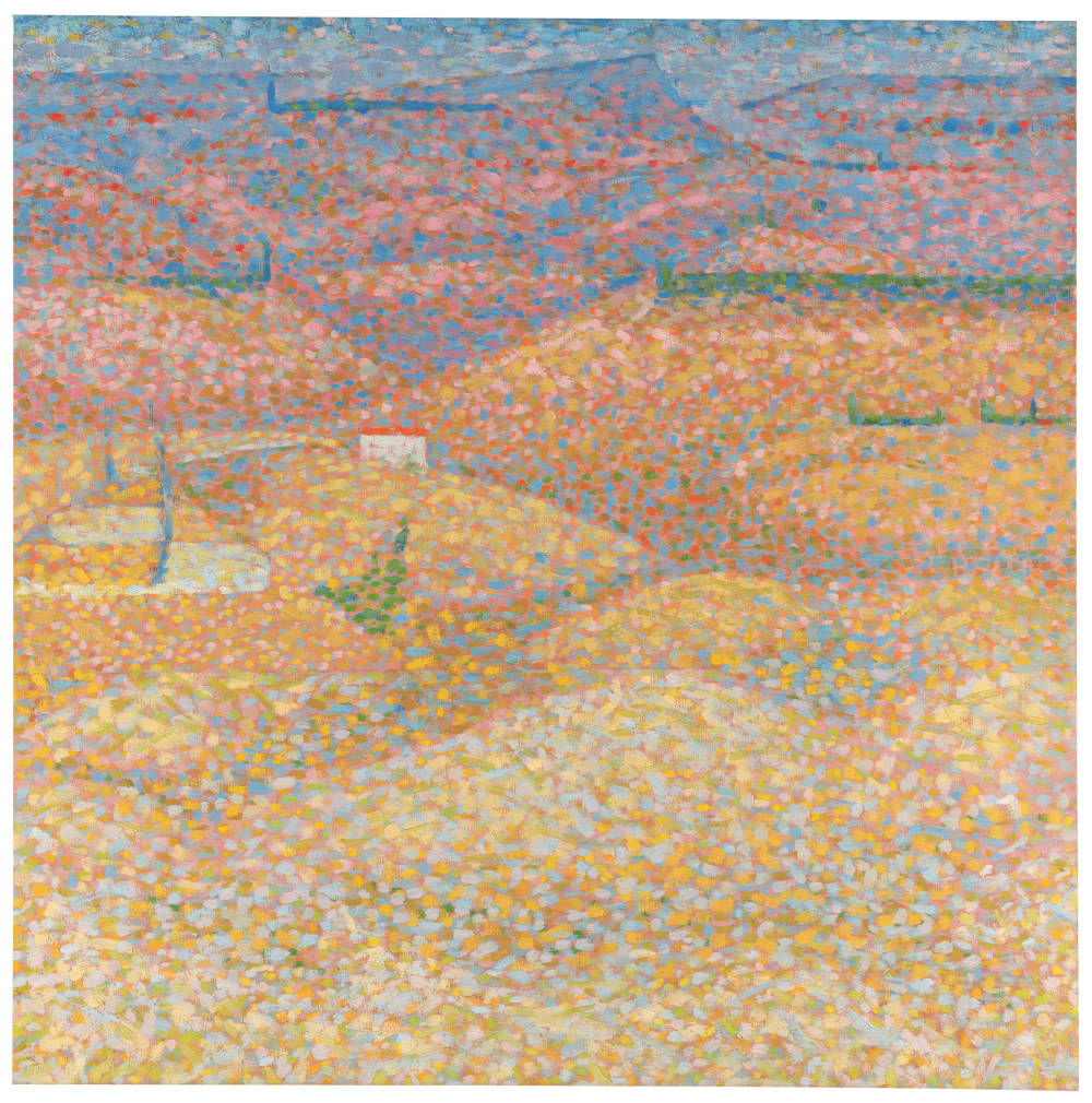
Bridget Riley, Pink Landscape, 1960, Private Collection © Bridget Riley
Bridget Riley, Achæan, 1981, Tate © Bridget Riley
Installation photograph of Into Place at TEFAF Maastricht

