As a complement to the festive season, InSight considers the radiant colours of Patrick Heron
InSight No. 162
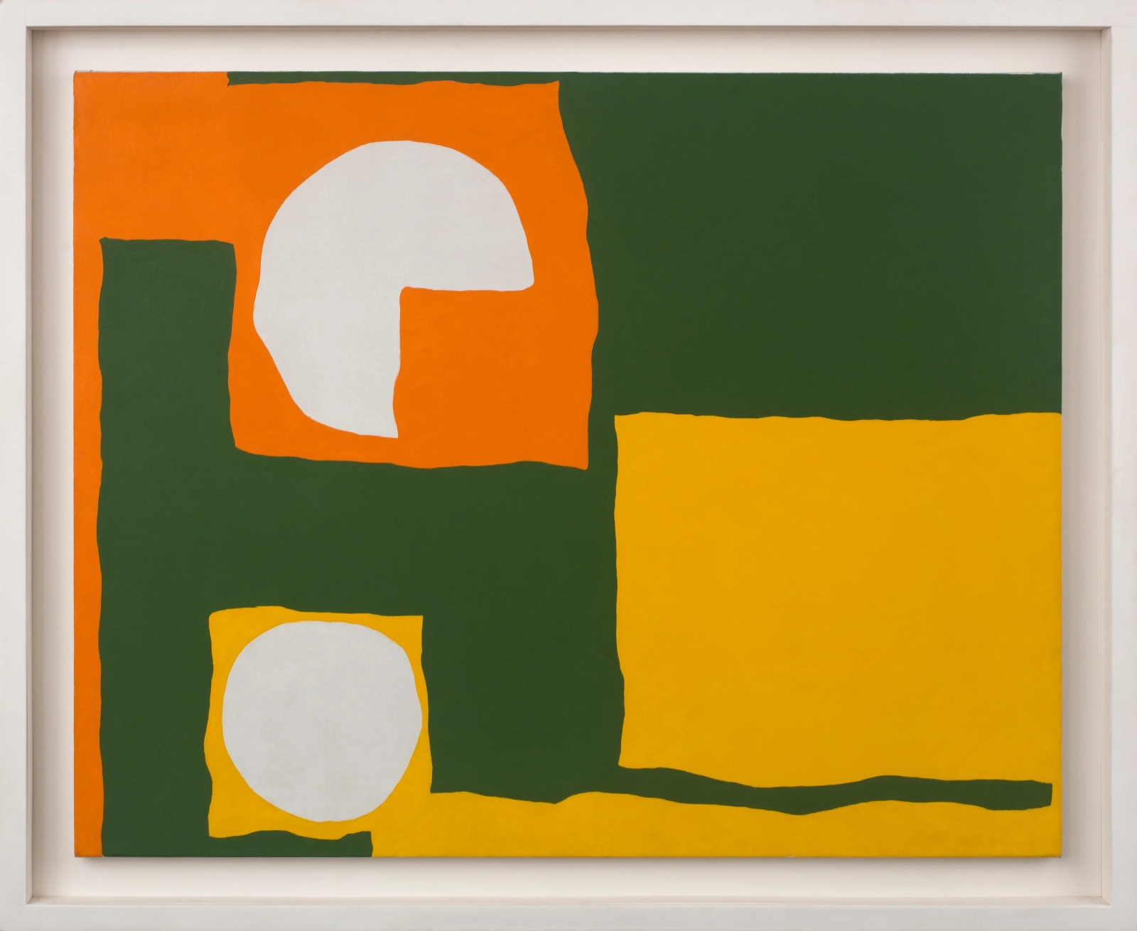
Patrick Heron, Orange, yellow, dull green and white : August 1965, 1965
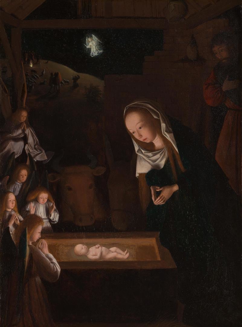
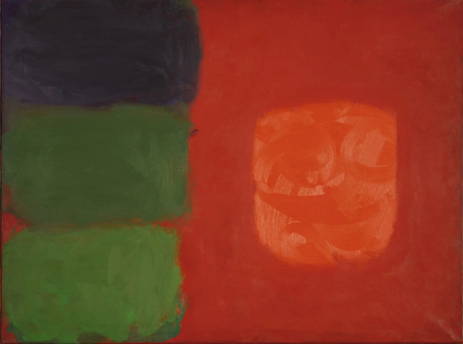
For most of Western art history, ‘the subject’ was a story derived from a textual source or whatever a painter made a likeness of. It could be anything from the Nativity as painted by Geertgen tot Sint Jans to Mont Sainte-Victoire as painted by Paul Cezanne. Patrick Heron (1920–1999) transgressed that pattern. In 1962, he acknowledged that ‘[c]olour is both the subject and the means; the form and the content; the image and the meaning, in my paintings today.’ Where many abstract artists have used evocative titles to suggest those ideas or analogies that connect with or inspire a work, Heron frequently used literal descriptions of the colours a painting was made from. He did this not to sidestep the problem of titling, but because he regarded the colours themselves as the substance of painting.

In 1956, when he broke with his previous style of Braque-like cubism and embraced non-representational painting, Heron began a sequence of stylistic developments. He was searching for a purer, more direct kind of painting. His ambitions were nourished by the example of advanced abstract painting in the United States, which was just beginning to be exhibited and discussed in Britain. Heron became an important proselyte for the new painting, writing as London correspondent for the New York magazine Arts Digest (renamed ARTS),and in his own work he adapted several of its characteristics: large format canvases, painterly mark-making, simplified divisions of the tableau, schematic contrasts of strong, non-naturalistic colour.

During his search over the next five years or so, Heron came to reject improvised flourishes. In 1963 he began to compose his compositions with spare charcoal outlines applied to clean canvas. These outlines complemented and encouraged his use of a sharper frontier between areas of contrasting colour. Where much of his work in 1958–62 was painted wet on wet, revealing the progress of his brush and causing neighbouring colours to smudge together, Heron’s delineated separation of colours from 1963 nevertheless retained the fluid, irregular silhouettes of his preceding work. But now the silhouettes were carefully planned and dictated by charcoal. Such preparatory work allowed Heron to make more sophisticated irregular shapes and to divide his canvases with greater subtlety. Most distinctive of these shapes was a rectilinear form, one corner of which issued a pier-like line, a framing device that extended into the neighbouring colour, heightening the contrast between itself and the colour that surrounded it on all sides.

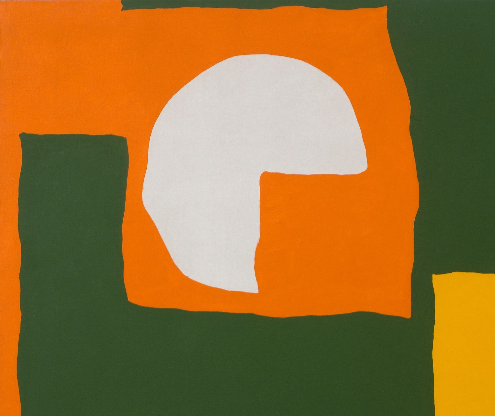
Orange, yellow, dull green and white : August 1965 epitomises the idiom that Heron used between the early sixties and the late seventies. Two spherical areas of white, one circular and the other a three-quarter circle, are represented by unpainted canvas. At their edges appear faint traces of charcoal lines. The paint surface is abidingly flat, being carefully built up with short, clean, singular applications of a loaded brush. Only close inspection reveals the texture of Heron’s brush. In contrast to the literal qualities of the matt paint surface, the colours of the painting produce supervenient spatial effects. The juxtaposition of light and dark colours causes them to advance and recede, moving towards and away from the viewer in different places. Such was the inventive power of Heron’s colour sense. The suggestion of gentle movement is deepened by the rippling edges of the forms, which create a sense of encounter between the neighbouring colours. They do not simply join but rather interact and respond to one another.
To make such strides towards a personal idiom of abstract painting, Heron stood on the shoulders of giants. Those giants belonged to an earlier generation which pioneered abstraction in Britain before World War II, notably Barbara Hepworth and Ben Nicholson, whom he joined amongst the avant-garde artists living in St Ives, Cornwall. Heron moved to a house called Eagles Nest outside the town in April 1956, which he occupied for the rest of his life, and when Nicholson left for Switzerland in 1958 Heron took his studio at Porthmeor Beach (see InSight 160). In some respects this resembled a passing of the torch, and the lineage of Nicholson’s painted reliefs of the war years can be traced in Heron’s mature idiom of the sixties and seventies. These groups of work speak a similar language of elementary shapes and impactful contrasts of colour. Yet Heron defied the syntax of constructivism: he rippled the edges; he asserted that colour was not merely form but subject too. Wielding his stature as a critic, he advocated for abstract painting, and as a painter, he made some of the most distinctive abstract paintings of any artist at work in post-war Britain.

Images:
Geertgen tot Sint Jans, The Nativity at Night, c. 1490, National Gallery, London
Patrick Heron, Scarlet in Vermilion with Greens : December 1962, 1962, Private Collection © The Artist’s Estate
Patrick Heron, Orange, yellow, dull green and white : August 1965, 1965, (detail)
Patrick Heron, Orange, yellow, dull green and white : August 1965, 1965 (framed)

